


Our team has been involved in many branding, advertising, collateral and packaging efforts the Toshiba memory products and data storage groups over a fifteen-plus year relationship.
Concept development, design, copywriting, photography, digital production.
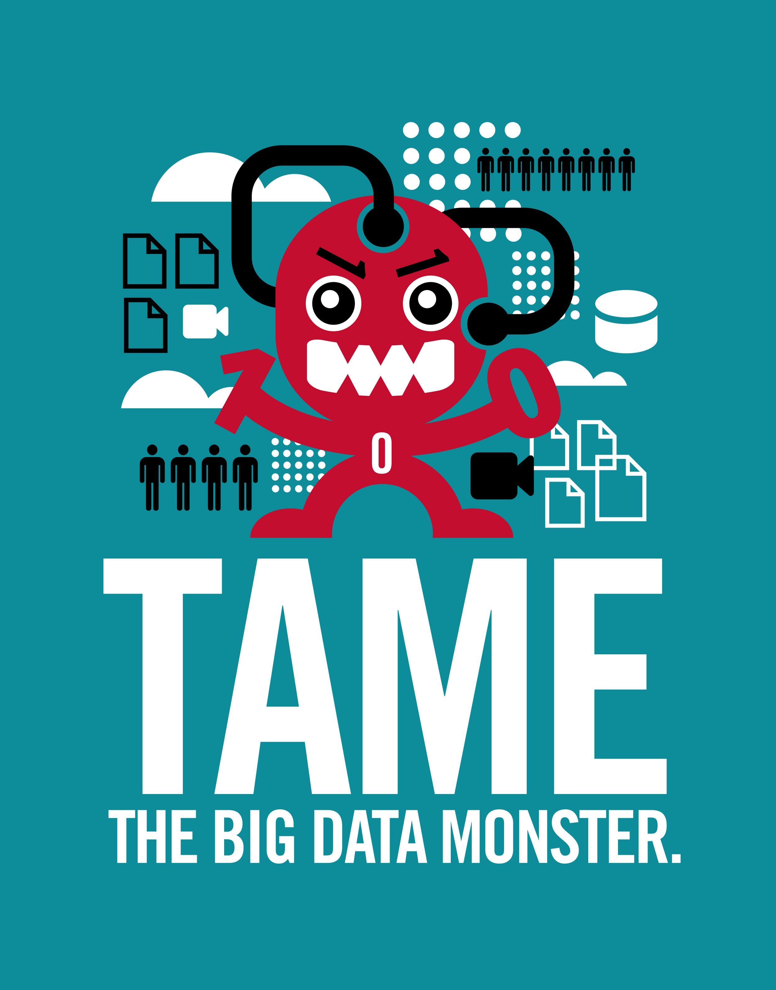
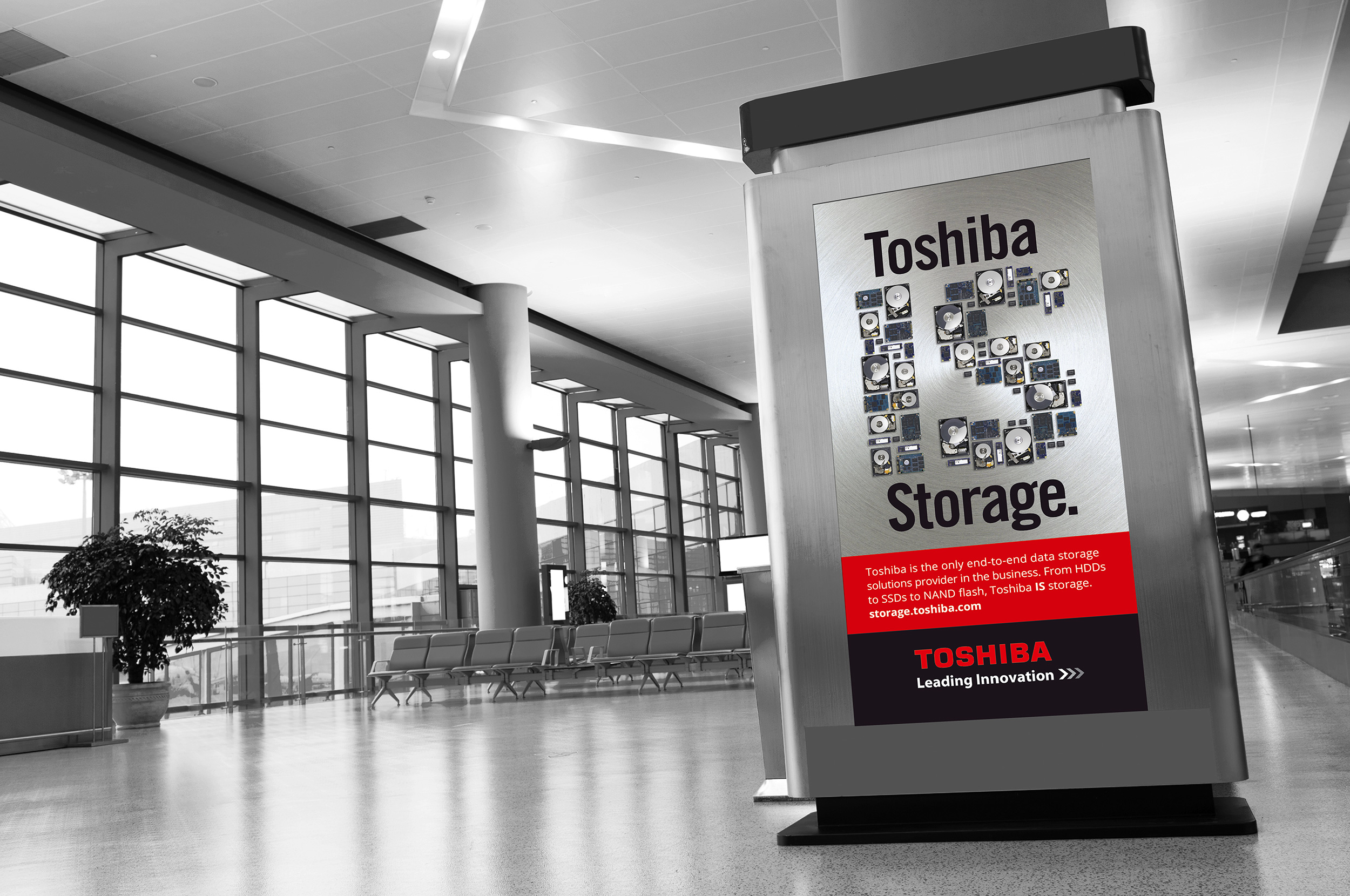
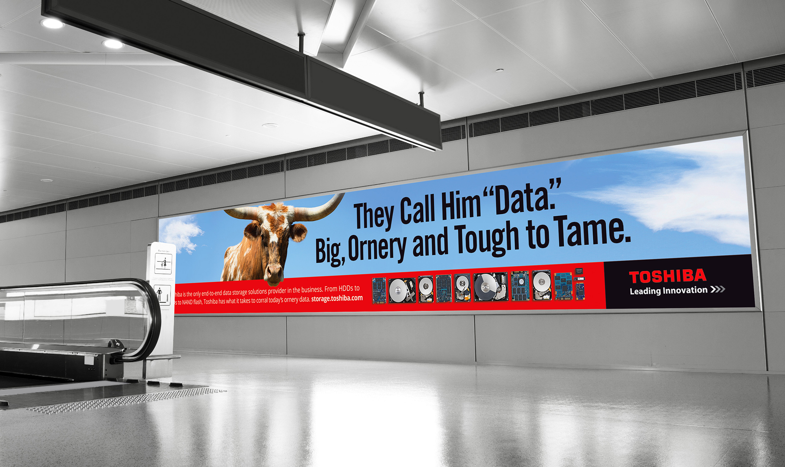
A leader in data storage technology, Toshiba was looking to increase awareness among engineering and tech industry decision-makers of its unmatched line of hard drive and solid state storage solutions. We developed an airport ad campaign, with multiple display ads (fabric banners, backlit displays and digital billboards) placed in the tech-center airports of San Jose, Boston, New York, Seattle, Dallas-Fort Worth and Austin. The goal was to create ads that positioned Toshiba as synonymous with enterprise data storage.
The lead concept in the campaign boiled the message down to the direct “Toshiba IS Storage.”
Other ads took different creative and visual angles to support that core position. Body copy was kept short and consistent with the message that Toshiba is the only true, end-to-end storage solutions provider.
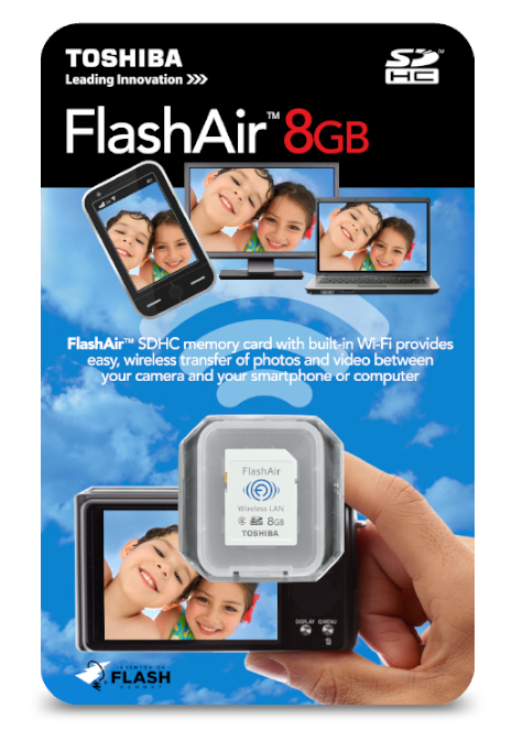
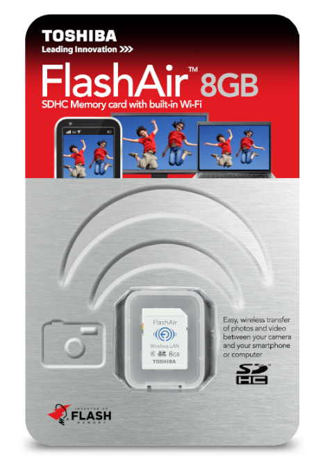
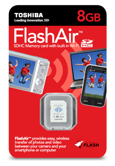
Packaging design concepts for the consumer retail space. In this case, the product feature was new on the market, so we tried to illustrate how it functioned with the graphic approach.
The challenge with this USB drive packaging for mass retail was to give the customer a quick look at what the gigabyte storage capacity numbers actually meant in real-life terms. So we came up with the approach of using icon bullets to estimate number of photos, minutes of video, and hours of audio.
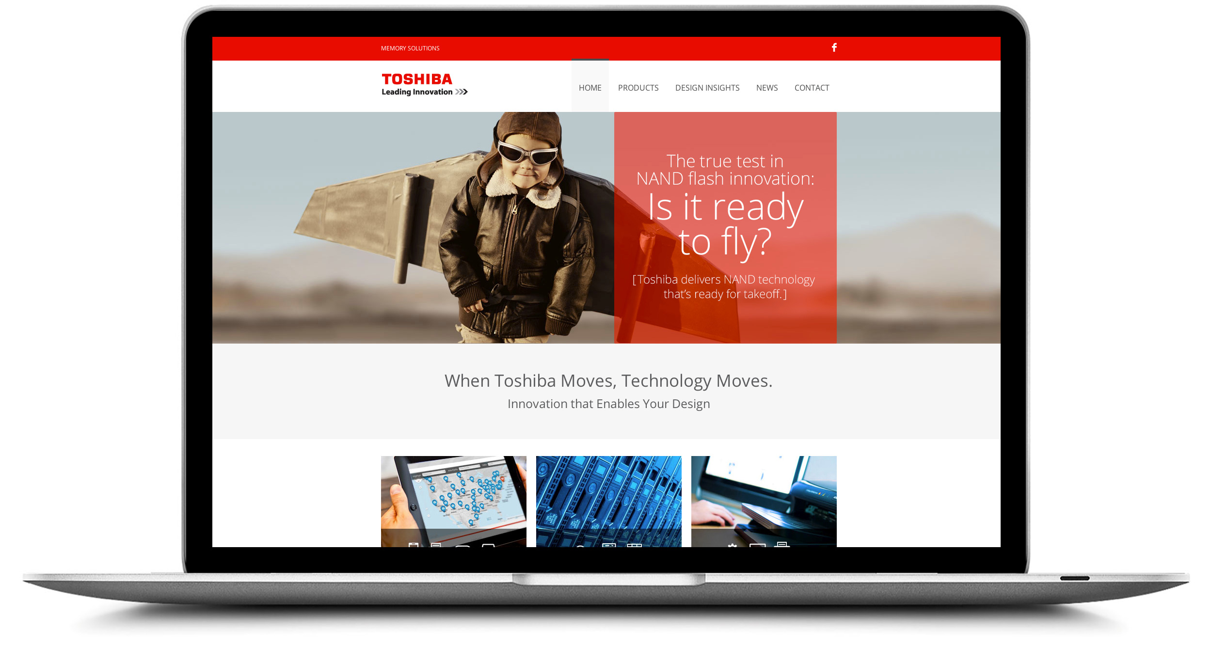
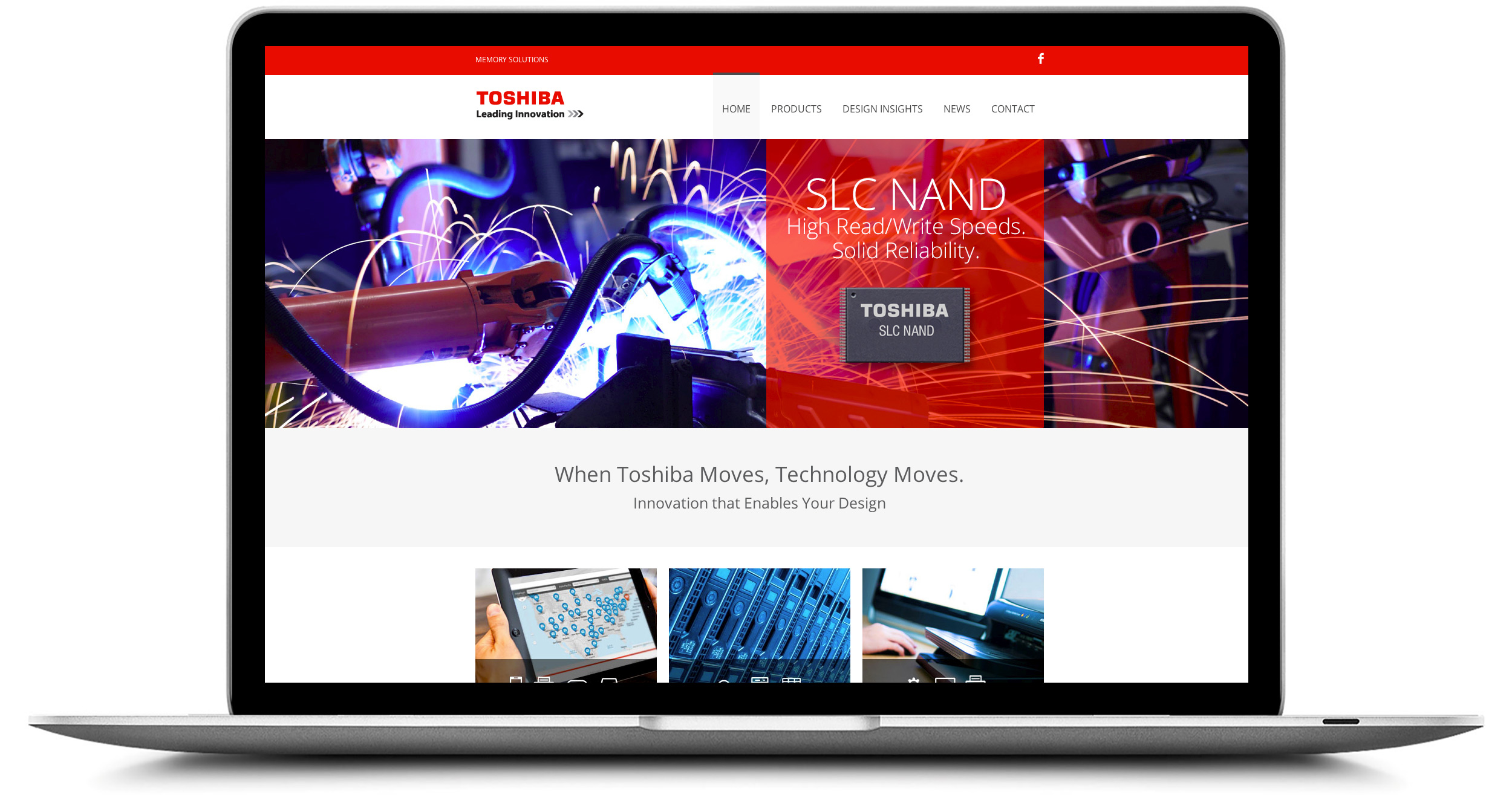
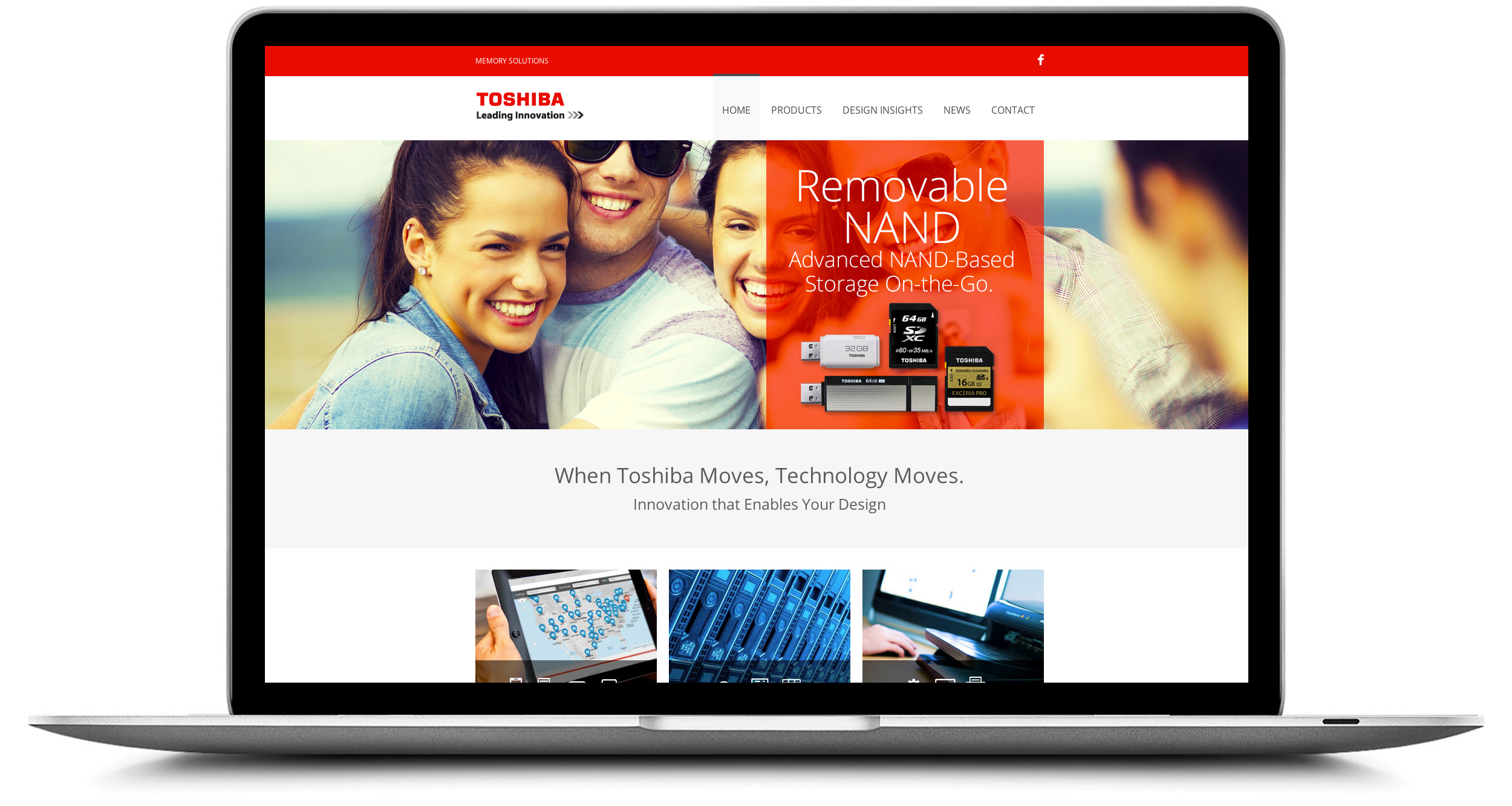
In the highly competitive realm of flash memory technology, a key issue was sorting what was "market-ready" technology versus new breakthrough announcements. So we were tasked with building a microsite for carrying that message to design engineers.
To support Toshiba's leadership history in hard drive technology (going back to 1967), we created the concept, copy and design for an online and print campaign, having fun with a '60s period style.