Wingnuts Restaurants
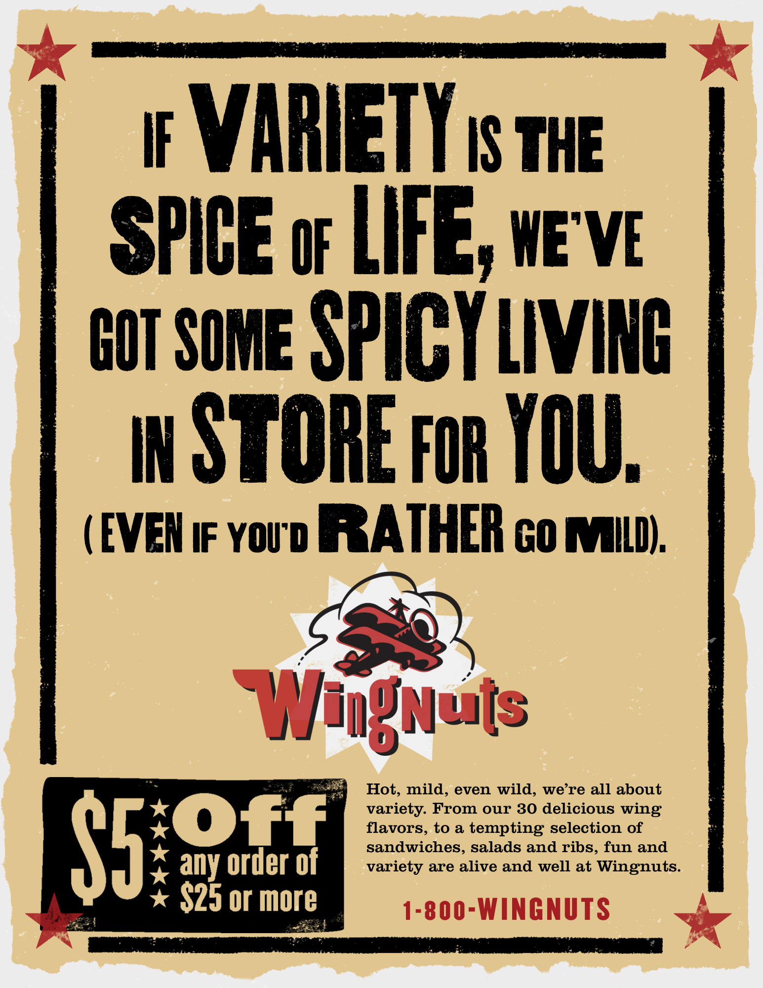
When the idea of a new restaurant chain based on a wild menu of 30 flavors of buffalo wings was still the concept stage, we were given the challenge of developing the brand image that would represent a carefree environment, exciting flavors and a little bit of craziness. The wing-walker logo, wood-type poster styles and references to early twentieth century entertainment were the direction we took. The identity elements were very effectively brought indoors by Wingnuts’ architectural firm.
Branding, name consultation, identity design, advertising concepts, copywriting, design.


This Wingnuts print campaign highlighted the theme and variety of the menu, using a tone that kept things light and whimsical.


